Design Noob: To Hamburger Or Not To Hamburger (that is the question)
"With great power comes great responsibility"- Spiderman's uncle Ben
Although the quote above is said by a fictional character in Spiderman, this is how I feel about good design. Whether you're designing a website, poster, booklet or an application, good design is really essential. And of course everybody has their own taste and preference in design, but with every choice one should ask him/herself: "Will the user get the message?"
Because that is really all we want right? Getting the message across. And since users are such....users, their attention span has gotten short over time. Within minutes, maybe even seconds, of downloading an application, they will decide whether or not to use your application (unless your app is super unique and the only one in the market on that particular subject. But expect some copycats to come along!).
And so I wanted to write about "Hamburger menus", yes thats what they're called and they look like this:
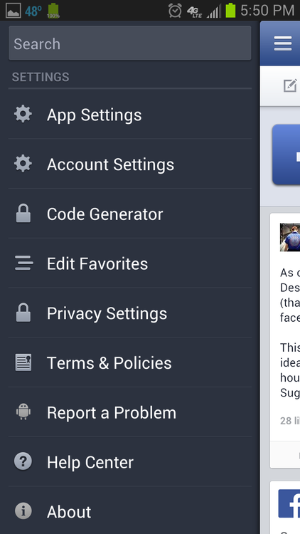
Apple does acknowledge the hamburger menu's and allowed their developers to incorporate it in their apps, but doesn't make use of it themselves. Why is this? Because, hamburger menus are bad non-intuitive UI design. And Apple loves intuitive design.
A reason why many developers incorporate a hamburger menu in their app is mostly because they kind of "dump" other not-so-important functionality in there just to save space in the app. With or without the knowledge that the user won't make as much use of it as they could be.
There are some keys items about intuitive UI navigation:
- they tell you where you are
- they tell you were you can go
And thus by these standards, a hamburger menu is too general and uninformative towards users.
The thing is, unless you're a power user or actually know whats going on in apps, some users don't know what the hamburger menu is, what it does and/or forgets about it. Another thing about hamburger menus that takes off a point for intuitive UI, is that it usually crammed with all kinds of functionality and it takes more taps to reach your goal.
So have you been convinced in not using hamburger menus? What you can use instead is how for example Instagram handles this:


secret first sneak peek of an app im working on with my partner
The UI tab bar controller only allows up to 5 items though. If you want to add more than 5 items, the fifth tab will turn into a "more" icon that allows you to arrange how you want your nav bar to look like. A nice way to do this is like this:

PS: if you're interested in more nice UI design stuff, look at one of my favourite blogs that keeps track of them: http://littlebigdetails.com


0 reacties