Swifty Design

When creating or thinking about a new iOS app it's always good to think the design through. Because let's be honest, there are so many apps in the AppStore (in July 2014 estimated at 1.2 million apps even!) that an app with a great design makes a big difference on whether an user will download your app or another app thats similar. Think about it, with 1.2 million apps in there, chances are quite high that no app (stays) unique. 
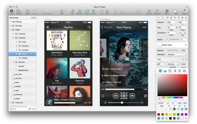
A nice program to use when thinking of an design for your app could be Sketch3:


When working on my school project we had to make some decisions on the UI. In the first release it was all focused about the functionality and you can clearly see that. In the second release we focused a bit more on the design. See for yourself: 

Release 1


Release 2


Typography

The kind of font you use in your app plays a big part. Xcode offers you a list of preinstalled fonts, which you can find here: http://iosfonts.com
If you don't see a font you like, you could also add your own custom font by downloading a free .ttf font. 


Hit Targets

In order for your users to be able to hit targets successfully in your app, you should keep in mind that those targets (for ex. an uibutton) should at least be 44x44points

Alignment

Alignment is such an important part to a nice design as a nicely aligned design is easier for the eye to see. Since an user's eye moves from left to right, up to down you have to make sure the hierarchy in your app is right.

When developing for iOS you've probably noticed that your elements sometimes don't line up like they should. This could very well be because you're not using auto layout...yet. Auto layout basically allows you to create dynamic interfaces that respond appropriately to the changes in screen size, localization and landscapes.
When using auto layout, you'll want to enable Size Classes so that your app will work on all available screen sizes.
With Auto Layout you arrange your app’s UI using relations between UI elements. These
relations are called constraints.
When looking in the right corner of your Xcode you'll see the following:


Other than this Auto Layout Menu you're also able to create constraints when you drag from one view to the other.
When creating a constraint you'll either see blue lines:
This means that the view layout is set up correctly. However whenever you see orange lines like so:
This means there's something wrong with your constraints. And even though the project might still build and run after showing orange constraints, its wise to fix it anyways. 
When looking for whether an element already has constraints, you can just click on the element and see which constraint are already being applied in the Size inspector.
Working with constraints definitely requires some practise as it can be hard for beginners to pick up.

Example centering a view

When centering a view you have to specify the position by giving the constraints for the X/Y position and Width/Height size of the object. 
As you can see, the button is not centered in the simulator as shown in the main.storyboard.


So by showing height/width and adding alignment constraints to center vertically and horizontally in the container, the button is now in fact centered!

Segue [pronounced seg-way] is great to have and use in Swift.
They allow you to send information from one page to another in the application. And with unwind segues you're able to send data back to the previous page.
In this post i'll be explaining how to send data back and forth with  the help of segues.

Let's assume we have 2 view controllers: A and B
and let's say we want to send data over from view controller A to B.
The following Swift code in view controller A prepares the sending of data:

 override func prepareForSegue(segue: UIStoryboardSegue, sender: AnyObject?){
}

So in this piece of code, you will want code the piece of data you want to send over to view controller B. But first you want to make sure there is a segue connection from A to B.


So what I did here, was I made a view controller A that makes a segue connection whenever you click on the button. You'll want to go for a push segue and after making this connection a new line will appear:


Whenever you click on this new connection, you can go to the Attributes Inspector where you can give an ID to your segue. This ID will be used to identify your segue connection in the code, which is nice to have whenever you have multiple segues happening. With these two view controllers I also have two Cocoa Touch Class connected where I can have the code for the segues:


So let's go see the code now.


The code in the prepareForSegue function checks what segue.identifier is being called when you push the button. Then you should assign the destinationViewController. 
The code in the B controller for receiving the object from A is as follows:

And the result after pushing the button:

Tadah! You just created your first segue!

So last week we talked about whether to place hamburgers menus in your application.
TLDR: the answer is preferably no.
In that case, let's see how we'll create a UITabBarController.

Making an UITabBarController is fairly simple if you didnt select an Tabbed Application when you first made your app. You can go about this in 2 ways. Either you drag in a tab bar controller from the object library:


Or by converting your current view controller in a Tab Bar Controller:


Either way now you have a Tab Bar Controller in which you can make your tab bars. What you'll see is that another Viewcontroller came along with the Tab Bar Controller. You can make your changes in this new Viewcontroller by double tapping on the label like so:


If you wanna add another tab to your Tab Bar Controller, you can do so by adding a new ViewController in your storyboard and connecting thiss new ViewController and the Tab Bar Controller by segue(pronounced: segway):

Select "view controllers" to create the segue
And yes! You'll see that another tab has been added to your Tab Bar Controller which you can customise with your own title and icon.
Just make sure your icon is available in the correct sizes. If you go to your Images group in your project and you click or add an basic icon thats used in the app, you'll see that there are 3 sizes: 1x, 2x, 3x. 
These different sizes are to make sure that the icons will be shown nicely in different kinds of resolutions. So make sure when you want to make use of an icon, you'll have to resize it in different sizes and drag those into the project. For the Tab Bar Controller the following sizes need to be put into the images group:
(more info about what sizes for what icons can be found here: https://developer.apple.com/library/ios/documentation/UserExperience/Conceptual/MobileHIG/IconMatrix.html#//apple_ref/doc/uid/TP40006556-CH27-SW1)
In the attributes inspector you can choose the icon you would like for your tab and your project will select the correct size of icon automatically based on which device its being used. Its like magic!


"With great power comes great responsibility"- Spiderman's uncle Ben

Although the quote above is said by a fictional character in Spiderman, this is how I feel about good design. Whether you're designing a website, poster, booklet or an application, good design is really essential. And of course everybody has their own taste and preference in design, but with every choice one should ask him/herself: "Will the user get the message?"

Because that is really all we want right? Getting the message across. And since users are such....users, their attention span has gotten short over time. Within minutes, maybe even seconds, of downloading an application, they will decide whether or not to use your application (unless your app is super unique and the only one in the market on that particular subject. But expect some copycats to come along!).  

And so I wanted to write about "Hamburger menus", yes thats what they're called and they look like this:


They should look familiar to you, since they're incorporated in so many applications nowadays. Just a nice little fact: Apple doesn't use any hamburger menu's in their own apps. They do however allow developers to put in their apps. But Apple's own apps? No thanks. And there's a reason for this.

Apple does acknowledge the hamburger menu's and allowed their developers to incorporate it in their apps, but doesn't make use of it themselves. Why is this? Because, hamburger menus are bad non-intuitive UI design. And Apple loves intuitive design.
A reason why many developers incorporate a hamburger menu in their app is mostly because they kind of "dump" other not-so-important functionality in there just to save space in the app. With or without the knowledge that the user won't make as much use of it as they could be.  
There are some keys items about intuitive UI navigation:
- they tell you where you are
- they tell you were you can go

And thus by these standards, a hamburger menu is too general and uninformative towards users. 
The thing is, unless you're a power user or actually know whats going on in apps, some users don't know what the hamburger menu is, what it does and/or forgets about it. Another thing about hamburger menus that takes off a point for intuitive UI, is that it usually crammed with all kinds of functionality and it takes more taps to reach your goal. 

So have you been convinced in not using hamburger menus? What you can use instead is how for example Instagram handles this: 

By adding an extra tab to your tab bar controller, you can clearly show users whats going on, because you can add a description to it (not showable in the instagram example) For example like this:


secret first sneak peek of an app im working on with my partner
The UI tab bar controller only allows up to 5 items though. If you want to add more than 5 items, the fifth tab will  turn into a "more" icon that allows you to arrange how you want your nav bar to look like. 
A nice way to do this is like this:


So say no to hamburger menus and make good use of the controllers that xcode provide for you, there's a good reason why they're there.


PS: if you're interested in more nice UI design stuff, look at one of my favourite blogs that keeps track of them: http://littlebigdetails.com
Hey guys,

So for this class i'm following, i'll be keeping a weekly blog about the amazing world of Swift and design. I decided to choose Swift and design as my subject, because i've always wanted to make a iPhone apps. Throughout my years as a IT student i've made apps for Android and Windows phone, but I always kept a special place in my heart for iPhone apps. Also, design because I love good design. Good design is so amazing, it makes my day. So, my goal for these coming weeks, is to learn how to make an amazing design with Swift.
Let's start with the basics.

So what I've noticed since I started learning about Swift, is that it's a little hard to find some good basic tutorials. This could be because many many developers went from Objective-C to Swift, which is a small and simple transition. So many tutorials will be about how to do stuff in Objective-C which you'll have to translate to Swift yourself. Luckily, more Swift tutorials are coming on their way so thats good. I wanted to blog about the basics of Swift and i'm gonna assume that you, the reader,  already downloaded xcode (look here: https://developer.apple.com/xcode/downloads/) and just wanna jump in all the goodness of code. So here is something you might wanna know:
Image credits go to Lynda.com 
So what you're seeing here is the lifecycle of a Swift project in Xcode. The files you see in here are the standard files that come with a project. So let's inspect each block on its own:

1. Read info.plist: A general configuration file read and loaded in by the@UIApplicationMain. So here you'll find stuff like the names of your launchscreen file and your main storyboard file

2. @UIApplicationMain: This is a built in function in iOS that creates an object called UIApplication (yes, the one from point 3) and your app delegate

3. Your app delegate/ AppDelegate.swift: Here goes your extra custom behavior code that you would want at application level. So for example what behavior do you want your app to have when starting up, going into background, when being determined etc.

4. UIApplication object: Kicks off the run loop and continues to respond to events

5. Launch screen file: This is the screen you see when your app starts launching. It gets its configurations from the info.plist

6. Main Storyboard file: After the launch screen file has been loaded, this is the main view controller that will be shown in your app

7. UIWindow: A single object thats automatically created that represents the size and boundaries of an iOS app. Content of an app shows up in here in this window

So those are the fundamentals of your iOS app. I feel like this should be your basic knowledge when creating your first Swift app since this is what makes your app! (even though its still empty waiting for your magic to happen)